
Our presentation was titled: “Navigating the Risk Landscape” by
Alison Bernstein, PhD & Iida Ruishalme, MSc
Last week I had the privilege to attend a conference on risk science in New Orleans, and hold a roundtable together with neuroscientist Alison Bernstein from SciMoms. We were kindly invited to talk about our approach to risk communication by Center for Food Integrity.
This was awesome! Not only did I and Alison finally get to meet face to face, we also got to present what we had learned about messages that work on social media (see our series: Risk In Perspective), as well as ones that don’t. In between many interesting sessions, on everything from food fears to radiological risk to supplements and climate change mitigation, Alison also introduced me to fresh beignets, fried green tomatoes and other New Orleans essentials.
For our presentation, one of the things we talked about was the varied success of our infographics for the piece Measures of Toxicity. In the article, we underlined the distinction that acute toxicity info (like LD50) is mostly relevant to accidents, murders and suicides, whereas what the public is often most concerned about are the gradual chronic effects. These are more appropriately reflected by the chronic intake limits, which are set in a way to try hard to avoid such effects.
We talked about what these metrics can and can’t tell us. We stressed that they themselves tell us nothing about the risks to consumer, because you have to consider actual exposures relative to these limits to assess risk.
We made tables of toxicity measures to go with the article, keeping in mind that social media heavily favours visual posts. With the infographics we wanted to make the point that any substance can cause great harm if the dose is high enough, and similarly, will have levels at which we expect there to be virtually no impact.


Now, always when you post an infographic, you know there will be a lot of people who will not read the accompanying article, so we have to try to make them cogent and clear enough to stand on their own. These tables evoked a lot of discussion, which might be their strongest point, and many appreciated and shared them. But it is also questionable whether they actually work well on their own, and people’s reactions to them taught me several things, some of which I want to discuss here.
First, people love their coffee! They will not take kindly to anything suggesting coffee could have risks. (No, the table values do not suggest we should give up coffee – or that we should take up a habit of drinking lead or hydrogen cyanide instead 😉 )

Secondly, how the regulatory intake limits (used in the chronic table) relate to consumer risk is not very clear to many people. When we think of the word ‘acceptable’ in everyday sense, it sounds rather like a mediocre test score, not a value hundred or thousand times below levels where minor harm might occur.
Considering that these limits are referred to in health-related news as well, this is a potentially a very large point of misunderstanding. Hearing there is an ‘acceptable’ limit for a substance, people quickly assume that crossing that limit must land us in dangerous territory.

Many would simply not believe that the daily limit for caffeine could be correct. I do understand how hearing that one’s own consumption is 1000 times above ‘acceptable’ would feel confusing – talk about a problematic piece of ‘science speak’
That it takes a thousandfold level of caffeine to achieve the effects many of us do want to have, and that such doses are not actually threatening to most people’s health, is a good demonstration of how conservative these ‘acceptable limits’ can be. Their purpose is to define a level where particularly at-risk populations (such as children, pregnant women) are very unlikely to experience any unwanted effects, even if the intake is constant throughout life.
The power of visuals
Having realized how elusive the nature of these acceptable limits can be, I was struck by a very simple graph I saw on a slide during an excellent presentation at the risk conference on intuitive toxicology and irrational food fears by Dr. Angela Bearth. Her research has reached heartening conclusions such as in her paper on Informing Consumers About the Scientific Risk Assessment of Food Additives:
it appears that informing consumers about complex food safety topics, such as the scientific risk assessment of food additives, is possible, and using a carefully developed information video is a successful strategy for informing consumers.
… and that video (in German) included a graph on finding the No Adverse Effects Level (NOAEL) of aspartame. Next to the NOAEL was a bar for the acceptable limit – hundred times lower. So simple, so elegant. Why hadn’t I thought about it? A simple visual approach would make the information more intuitive. Being a bit short on video-making skills, I decided to go at it with an infographic.

While setting the limit, factors like the speed of breakdown (the potential for accumulation), what foods it is found on, and how much of those foods people tend to eat, are taken into account. For a detailed account of how the safety margins are determined, please see Alison’s piece where she uses coffee and glyphosate limits as the examples, or the EPA’s page on how pesticide tolerance limits are set, and similar guides for the OECD countries. Note that depending on region and class of substances, the names of the limits vary (common ones include Acceptable Daily Intake, Reference Dose, and Tolerable Daily Intake) – more about that in our piece Measures of Toxicity.
Regulatory limits vs reality?
In addition to the limit level, I decided to look at some real world data on what kind of trace levels are actually found. I chose pesticides residues, because they are a prime suspect for inflated sense of risk: they tick the boxes of being unfamiliar, manmade, and imposed, so we are biased to view them with exaggerated caution. As a result, many consumers worry about pesticide residues out of proportion.
One way to look at this are to consider various food-stuffs and their typical residue levels – as Steve Savage does here, looking at the annual USDA pesticide residue database. Detailed information is also available on the Californian pesticide testing regimen, which samples thousands of food items every year. They tend to find that about 40 % of foods tested have no detectable residues at all, and that in the remaining portion the residues tend to fall much below 10 % of the limit. (The limit which is already 100-1000 times below a level where we still would expect no effects.)
Added: Similarly for Europe, as analysed by EFSA, yearly tests find about half of the samples to be free of residues, and more than 96 % to fall below the Maximum Residue Limits (MRLs), which are often set at even lower levels than the Acceptable Daily Intake (ADI), taking into consideration that farmers are often able to use the pesticides at levels where residues remain far lower.
A few percent of cases in Europe, as well as those in California, do have either levels above the limit, or an unapproved kind of pesticide residue present. Both regulators note that majority of the time, this does not indicate a health concern – with rare exceptions, like in 2013, when cactus pads imported to California from Mexico were found with potentially harmful levels of organophosphates. (They were subsequently removed from sales and imports monitored.)
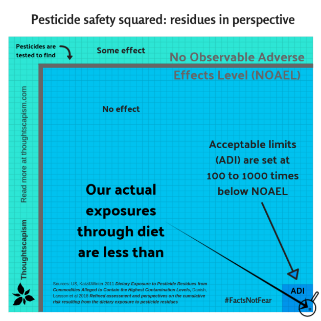
Looking at how much above the acceptable limit we need to go before we even expect effects, this lack of health concern is not all that surprising. I wanted to try to make this information more intuitive as well, and I think the most relevant approach would be to look at our actual average exposures – how much do we end up taking in through our diet?
I know of at least two studies that have made these kinds of estimates, a Danish one looking at cumulative pesticide exposures from earlier this year, and one from US from 2011. These studies looked at 25 and ten most commonly detected residues, respectively. Neither found consumer exposures to exceed the acceptable limit. The scientist in me did not feel comfortable without allowing for at least some uncertainty, however, so I chose to go with “more than 99.9 % of the time our exposures are below the acceptable limit.” This infographic is much more cluttered compared to the first one… but it’s a start.

UPDATE: Trying to make the magnification look clearer, swapped arrows for a triangle. Sources: US exposure estimate paper and Danish paper on cumulative risk.
Both studies found that the highest exposures were around 2 % of the limit, and that majority were even below 0.5 % – in fact, the US study found that in almost half of the cases, we are exposed to less than 0.001 % of the acceptable limits. Even with a combined assessment, assuming that these residues could together amount to more risk, the Danish paper finds that consumers cumulatively reach about 16 % of the acceptable intake limit.
UPDATE: I couldn’t stop thinking about wanting to improve the residue-graphic, and decided to try a different approach, here:
Using areas, it is easier to keep all the different levels visible (the visual comparison of areas instead of heights may underestimate the values somewhat for the viewer, but I think here it is useful nevertheless, because the differences are still huge, but it brings the levels to a form that is more easily viewable at a glance.

There is no such thing as zero risk, but our own simple life-style choices can mitigate by far the largest risks.
I am still digesting the insights and extra materials I accumulated from the risk conference, and I hope that they can make me better at communicating risk. When I think of how much anxiety goes into many areas that pose very tiny risks, it really makes me wish that I could find a way to make the information tangible in a way that would take away needless fear and help empower the public.
I want parents, grandparents, and all worried or health-conscious consumers to know that they are in control of their well-being: there are no invisible threats to eating plenty of fruits and vegetables, which, along with regular exercise, is the single most effective secret to living long and healthy lives.
![]()
For more about some common concerns over substances in agriculture and medicine, you can find articles under Farming and GMOs and Vaccines and Health.
If you would like to have a discussion in the comments below, please take note of my Commenting policy. In a nutshell:
- Be respectful.
- Back up your claims with evidence.


As always a great piece. Can I as for a PDF of your final figure as it does speak volumes.
LikeLiked by 1 person
Thanks! I am happy to send you a PDF, you can drop me a line with your email in the feedback page (About me has one), or on FB, and I’ll provide it for you.
LikeLike
Yes, excellent as usual. I, too, would like a hi-res pdf of that final summary graphic.
However, I do not understand the basis of factor of 100 or 1000 between the NOAEL and the acceptable daily intake. It’s clearly overly cautious because exceeding by the ADI by factors of 10 is not worrisome. Is there justification for:
10X to relate animal study to human study? Doesn’t depend on the animal? Are not dogs and pigs more relevant than mice and rats?
10X to explain human-to-human variability? Seems a lot. is this 1 in a billion?
10X to understand chronic to “sub-chronic”, a vague concept somewhere between chronic and acute?
LikeLiked by 1 person
Hi Robert!
Happy to provide you a copy as well (chuckled at getting a double-Robert-request), will shoot you an email soon, I found your address from earlier.
As to your other questions, they are both good and difficult. I remember hearing Peter Sandman, who has worked a lot in risk communication, deride toxicology as a field precisely because of how difficult it is to justify their safety margins to laypeople. Sometimes it may be hard to justify them to toxicologists as well, and there may be noticeable difference in which kind of safety margins they arrive at, say, between the regulatory bodies in the US and EU.
If you follow the link I provided in the piece for NIH entry on intuitive toxicology, it says:
“Even well-established scientific approaches used in human risk assessment depend on extrapolations and judgments when assessing human, animal and other toxicology data.”
My take-away, as a non-toxicologist, is that there is a fair amount of judgement and (probably) a generous helping of precautionary principle in the safety margin decisions, yes. But I do hear that some suggest that even more conservative approaches should be used. And as a general bet, I’d be willing to wager that say a monkey data is more likely close to human data than a mouse. But could there be the case in some pathway or other that we have more in common with a mouse than a dog? It’s possible too.
Probably much of the judgements are based on what in some cases is known about the similarities or differences in reactions between humans and various animals, but (for understandable reasons) for many substances, we simply don’t have systematic data on the kinds of harms they might or might not cause for humans, so there are unknowns we just have to handle somehow to the best of our (skilled toxicologists’) ability.
To give a better answer, I can see if I can chase down a toxicology trained someone to give their five cents. 🙂
Thanks for reading and asking questions!
Iida/Thoughtscapism
LikeLike
Oh, and one point I forgot to include: exceeding the ADI, even by a lot, if it’s not a constant exposure, is not necessarily dangerous at all. If it’s about a one-time exposure, we can get away with a lot more without necessarily experiencing much harm – for reference, see the axcute toxicity graphic, that gives you an idea how much you have to take to get to lethal levels.
LikeLike
Hi,
Any explanation idea for the difference between the EFSA pesticide residue report, performed yearly, and the aforementioned study ?
The EFSA usually reports about 3.8% of the tested product to be above the maximum residue limits (around 85,000 samples europe-wide)…
https://www.efsa.europa.eu/en/efsajournal/pub/5348
This seems quite different from the 0.1% mentioned here.
LikeLike
Hello Nicolas,
Thanks for your interest! Actually, the EFSA data is strikingly similar to the California data I just presented here:
“A few percent of cases in California do have either levels above the limit, or an unapproved kind of pesticide residue present, although they note that majority of the time, this does not indicate a health concern”
But for the second infographic, I chose to look at our exposure through diet. Those two studies I refer to considered data on pesticide residue levels and made estimates on how much each of those would contribute to total human exposure. Each foodstuff is only a small part of our diet, and all in all they have such low residues that it amounts to a very small total, which is where the figure 0.001% of ADI at 40+% of the time comes in.
In other words, all the residue data goes in to calculate the human exposure data, but they are two different things – one considers, say, one carrot at a time, whereas the other approach looks at everything a person would intake and what their exposure would amount to.
Hope this clarified things.
Iida/Thoughtscapism
LikeLike
To clarify further, MRL is often not set at a level of an ADI, but at much lower level.
At which level which different acceptable limits are set, is a somewhat complex topic. To try to give a simple overview, in the first infographic I simply refer to ‘acceptable limits’ and the general trend of 100 to 1000 times lower than NOAEL. But Maximum Residue Limits might end up even more than 1000 times lower that level.
As EFSA says: “8. Are MRLs equivalent to toxicological safety levels?
No, MRLs are not primarily toxicological safety limits. They are set at a level that does not pose a risk to consumers, but they also reflect the minimum level of a pesticide that can be used to achieve effective plant protection i.e. to keep crops healthy and prevent them from being destroyed as a consequence of disease and infestation. MRLs are often set at levels far below toxicological limits. Furthermore, the presence of pesticides in food at a level exceeding the MRL does not necessarily imply a safety concern.” https://www.efsa.europa.eu/en/topics/topic/pesticides?fbclid=IwAR1trkDvQmz9Th7OCqg8eOFxT7RcKwteexVlVFBq6rFk7IDGm6H845-LyEs
This means that if a pesticide can effectively be used at a level that leaves a very small residue, then farmers are supposed to follow this best procedure, since regulators know they can adhere to levels that may be a lot lower than the final ADI of the human exposure is set at.
This means that even levels above MRLs, when calculated into average human intake, may not come close to Acceptable Daily Intake levels for us.
Let me know if you have any other questions!
Iida/Thoughtscapism
LikeLike
Pingback: Radiation Exposures at a Glance | Thoughtscapism
Thank you for this article ; a useful one, in order to allow people to understand something in that field. But your article is good only for people who have the scientific background and who have also the time to read all that stuff. Normally we should rely on journalists for writing such articles that are scientifically rigourous as well as accessible to the general public. But journalists often lack the scientific level and they rabacheent the same commonplaces by repeating constantly the same antiphons on pesticides… So, for that job we can’t rely on them (for the present). But for talking to the general public, it is necessary to find the intermediate presentation; a full job in itself. Perhaps you could make videos on such vulgarisation ? I think so. Thank you for your valuable contribution
LikeLike
Pingback: Chemical Exposures: The Good, the Bad, and the Tiny | Thoughtscapism
Pingback: A good journal breaks bad: AAP spreads misinformation about glyphosate - Axo News