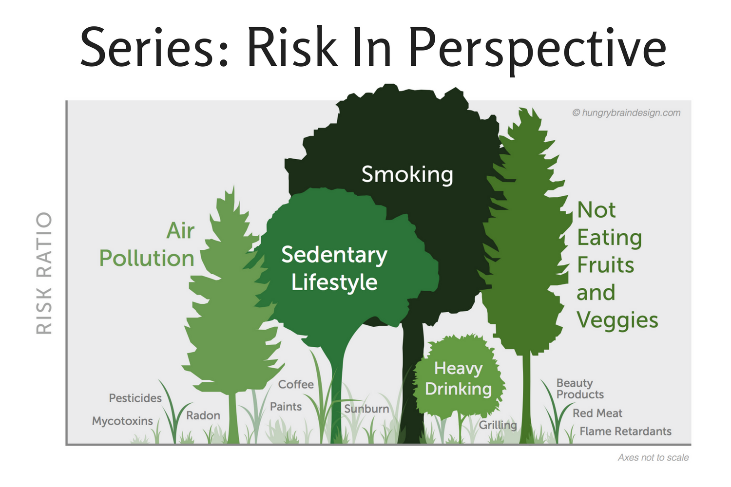
Inspired by a risk conference I attended, I decided to try my hand at visual demonstrations of toxicological safety limits and pesticide exposures. It struck me that the same kind of visualisation might work well for a demonstrating radiation dosages. I have written earlier about Radiation and Cancer Risk, after I visited Switzerland’s interim repository for nuclear waste, ZWILAG. While in the heart of the place – the dry cask storage hall which houses the spent nuclear fuel – we crossed a line with a sign that read: “HIGH RADIATION AREA No unnecessary stay !!!”
This left me curious. I wanted to know how dangerous a “high radiation area” was, and after a dive into the evidence, I got my answer. But much of what I wrote there could also be effectively summarised with an infographic.
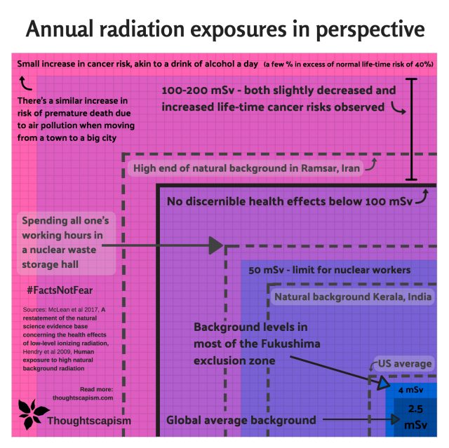
I used squares, much like an excellent large-scale xkcd strip on radiation, but mine is a compact one with concentric squares, showing the dosage range from where cancer risks become clear, where they are less evident, and all the way down to the global average background. This graphic is rounded up or down to closest useful number of squares, give or take a few mSv, but it is approximately accurate.
Most of the references I already delved in at length in the earlier piece, but to elaborate on the points of the graph, you can also find the sources here. Going from the higher to lower levels:
Radiation above 200 mSv
The increase in cancer risk at the level of a few hundred mSv-doses depend a lot on things like the type and rate of exposure (more risk if it is accrued within a very short time period). For a rule of thumb, an example of what I can find in the literature says: “A widely used figure is a 5 % excess risk of death from cancer with a 1 Sv (1000 mSv) dose.” This puts 220 mSv – the maximum annual dose represented by the box, the dose exceeding 200 mSv visible in the pink outer area – at about 1.1 % risk of death, and around 2 % increased risk of incidence.
Risks of alcohol
How does that relate to alcohol risks? One drink a day, according to a massive study in Lancet from earlier this year, increases chances of getting poor health outcomes by 7 %, roughly one third of the outcomes being cancer. They also say having 1-4 drinks, 4 or more times a week, increases mortality by 20 %. For women, earlier studies have found that one drink a day is estimated to raise incidence of breast cancer alone by about 5 % – that would mean going from about 12.4 % life-time risk to 13 %. The Lancet study raises that estimate further, from 5 % closer to 10 % increase. A good discussion on the study can be found in Washington Post. All in all, seems like one drink a day can raise cancer incidence by at least a percent, and incidence of all-round poor health outcomes by several percent.
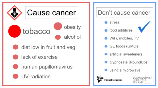
Largest cancer risks vs some of the most prominent cancer myths. Find out more in the piece: Do we fear the right things?
Baseline cancer rate
Bad news is that life-time normal baseline risk of developing cancer is nearly 40 %. Pretty high, huh? A very large part of that is inevitable consequence of the error rate in our biochemical processes, too. Smoking, obesity, and alcohol, meanwhile, are some of the largest risk factors we do have control over. It’s also important to eat lot of fruits and vegetables, and don’t let fear of minuscule pesticide residues stop you – the risk to health is negligible, the benefits of fruits and veggies are huge.
Lower annual doses of radiation
Next let’s look at the area of the darker pink square: the outer half corresponds to a dose of 100-200 mSv per year.
A recent summary paper on radiation has an instructive graph on the landscape of studies on radiation and cancer risk. As I wrote about it earlier:
Below 200 mSv (or 0.2 Sv in the graph), we see both positive and negative correlations – slightly decreased or increased life-time cancer risks. […] it seems to be the case that in places with naturally very high background radiation (even higher than Tampere), like Kerala in India, and Ramsar in Iran, populations can live in areas with natural exposures that reach up to 40-130 mSv per year without yielding very definitive effects on rates of cancer incidence.

McLean et al, 2017, A restatement of the natural science evidence base concerning the health effects of low-level ionizing radiation.
The European Commission health information likewise makes the observation that: “The effects of very low radiation doses, say below 100-200 mSv, are very difficult to demonstrate in epidemiological studies.”
On Ramsar: while I’ve found remarks about even higher background levels (a BBC article says: “The world’s highest background radiation rate is found in the city of Ramsar in Iran, which has the astonishing rate of 250 millisieverts a year.”), the paper I’ve seen that lays out its inhabitants exposures, cites 131 mSv as the highest yearly exposure. Similarly, the high end of the range for Kerala was given at 40 mSv (the dotted line right below 50 mSv, in blue-violet square).
Moving on to below the black line, and on to the first violet square. The only clear links to increased cancer risk at 100 mSv came from the population exposed to the nuclear bomb in Japan, who received their exposure within a very short time. Below that level the relevant UN body UNSCEAR does not recommend extrapolating a linear risk. For more gradual exposures, as iterated above, the evidence is also not very conclusive.
The annual dose limit for nuclear workers (the blue-violet square), is often set at 50 mSv, but I’ll note that there are exceptions: Switzerland (where I live) uses 20 mSv.
The smallest squares
The lowest dotted line shows the US annual average of about 6.2 mSv (of which 3 mSv from medical imaging). For context, Switzerland has about 4 mSv. UNSCEAR characterises 1-13 mSv to be the typical range, while noting that sizeable populatons are exposed to 10-20 mSv.
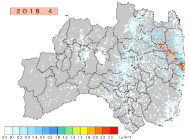
Japanese authorities’ timeline view found here
Fukushima exclusion zone, while it does have areas with higher radioactive background, has for the most part quickly fallen to levels of about 4 mSv a year (map of levels can be found in this article, or you can view the timeline of the levels by the Japanese authorities here – 0.5 uSv/h is about 4 mSv/year). Even the full exposure of the accident, for the most part, was so small, that scientists say the negative health effects of the evacuation were much larger than the risks of the a small increase in exposure to radiation: the evacuation was not worth it.
I realize I skipped one the points – the answer to my question, the reason I started reading more about radiation science in the first place. What about the nuclear waste hall? While hugging a freshly filled, still warm cask non-stop would not be a good idea, simply standing in the middle of the hall, beyond that yellow warning line, for 40 hours a week every week (couldn’t be very efficient work, granted – but no time taken off for holidays!), with an hourly rate of about 30 uSv, would yield an exposure of about 62 mSv/year. This is the dotted line in the larger violet square (area between 50 and 100 mSv).
You can read more about the interesting insights gained during my visit to the waste facility from: Warming My Hands on Nuclear Waste, or about how I first came to reconsider my views about nuclear waste in: Nuclear Waste: Ideas vs Reality.
![]()
For more articles on nuclear power and radiation, you can find my pieces under Climate and Energy.
If you would like to have a discussion in the comments below, please take note of my Commenting policy. In a nutshell:
- Be respectful.
- Back up your claims with evidence.


Pingback: Radiation and Cancer Risk – What Do We Know? | Thoughtscapism
Wade Allison says 100mSv per month is a perfectly safe limit (in Nuclear is for Life)
LikeLiked by 1 person
It’s the same as with sunshine. If you go out into the sun totally pal you get a sunburn but if you have constant expose you have a tan and produce Vitamin D and it is healthy. Same applies to nuclear radiation. Constant expose is good for you but a single blast of 100mSV is unhealthy. That is why we have positive and negative outcomes in the 100 to 200mSv per year range.
What we as humans should do, is be rational about it and legally allow higher exposure, that would make nuclear much cheaper and give us abundant clean and safe energy from modern super safe nuclear power plants. The governments regulatory grip is too tight.
LikeLiked by 1 person
I wrote a book on Radiation several years ago. (Click through on my website link for this post.) It started as purely a treatment book that explained what was going on with radiation damage, doses, and how to treat radiation exposure. I added several chapters later to explain what radiation was, show graphs similar to these, and discuss nuclear accidents and popular Twitter-feed malarkey.
Radiation is complex, and there are a number of different forms. A great deal of what is written (most of the popular journalism) is balderdash. Doses that cause detectable effects are quite high. Radiation is one of the weakest carcinogens around.
I wrote a chapter on hormesis and radiation exposure. It’s complex, and biological exposure is not all that well understood.
Thank you for writing this, because the world changes one mind at a time with education.
LikeLiked by 2 people
Another nicely executed and helpful article!
LikeLike
Here is a good link on the same issue from the Skeptical Inquirer: https://www.csicop.org/si/show/from_the_spectral_to_the_spectrum_radiation_in_the_crosshairs
LikeLiked by 1 person
Pingback: “What About Chernobyl?” World’s Deadliest Energy Accidents in Perspective | Thoughtscapism
Hi Iida. I was wondering: do we apply the LNT model to chemicals classified as carcinogens whose concentration in e.g. drinking water is monitored? Or do we say below a ppm threshold the water is “safe” ? If so, it would seem that the same approach should be applied to radiation. If we operated on the notion that there was no safe concentration of lead in our water then we’d all die of thirst.
LikeLike
Pingback: Visiting Chernobyl, Day One, The Most Dangerous Part of the Trip: Kyiv | Thoughtscapism
Pingback: The Town That Remained Despite the Chernobyl Accident | Thoughtscapism